Accessibility Color Design
Designing for Colour Blind Users
Designing for Colour Blind Users
Worldwide 8% of men and 0.6% of women suffer from a form of colour blindness, and these figures rise in certain countries.── Colour Blind Awareness
TEAM
Aqs Malhotra, Chih-ling Kuo
DATE
November, 2018
CONTEXT
We have been asked to design and build an understanding of accessibility experience in the mobile context for Color blindness. We explore and apply Accessibility Color Setting inside this Calendar app Experience.
SKILL
Sufficient color contrast
Universal Design
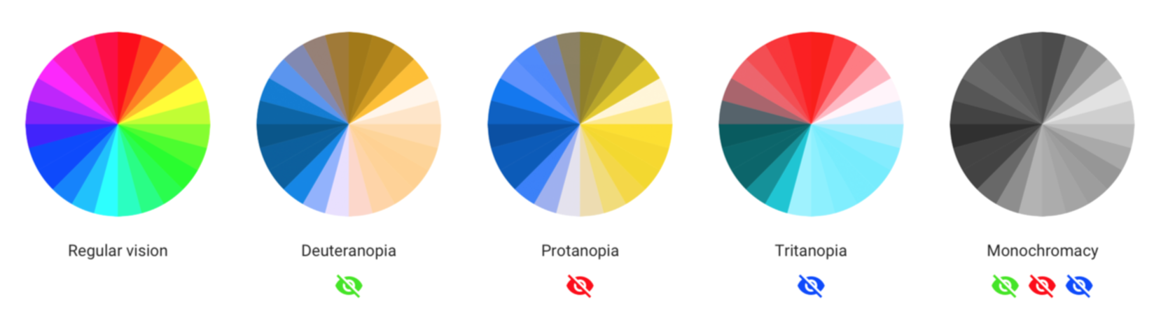
Types of Color Blindness
Deuteranopia: Blindness to green, wherein green cones are lacking and blue and red cones are functional.
Deuteranopia: Blindness to green, wherein green cones are lacking and blue and red cones are functional.
Protanopia : Blindness to red , a state in which the red cones are absent, leaving only the cones that absorb blue and green light.
Tritanopia : Blindness to blue, usually with the inability to distinguish between blue and yellow, which occurs when blue cones are absent.
Types of color blindness- photo by Ivan Tuchkov
Most people design for Deuteranopia due to it is most common color blindness, around 5% male are Deuteranopia. However, we should not ignore the minority needs. In this project, we choose to design for Protanopia. Approximately 2.5% of men are Protanopia, and my group member Aqs, he is that 2.5%.
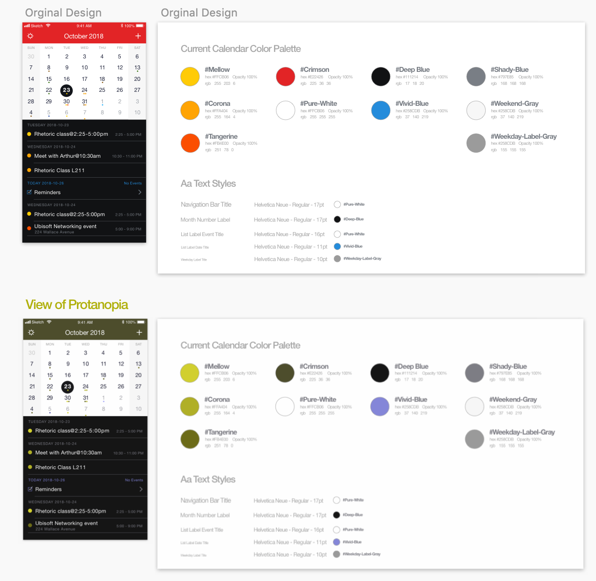
The Original Design
The color of orginal design are colorful for general users. Nevertheless,in the view of Deuteranopia, these color are not distinguish clearly.
In addition to the not colorblind-friendly color, the interface of this App, also have below issues can be improved.
First, it is not explicitly present what day is today. In this scenario Oct 23rd is not today until I saw the Reminders, I realize that 26th is today. On the other hand, 23rd is the day that user picked.
Secondly, the picked day only be a highlight on the calendar, the day in the list is not highlighted, the background is black as same as other days. I think it can be improved.
Finding Suitable Color
Sufficient color contrast ratios
Insufficient contrast in your app makes content hard to read for everyone. Icons and text might blend with the background, for example. Strive for a minimum contrast ratio of 4.5:1, although 7:1 is preferred because it meets more stringent accessibility standards. ── Apple Inc.
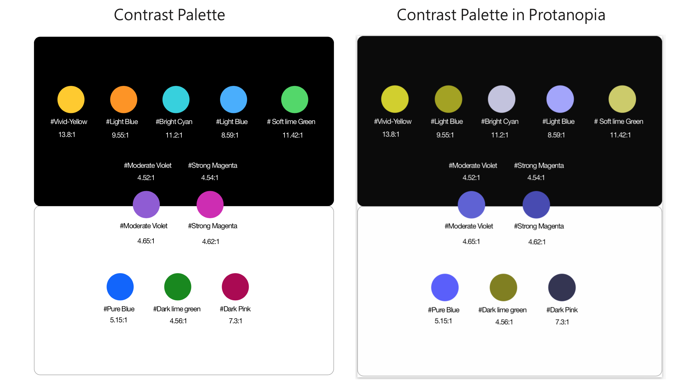
The color we create, contrast with black and white
While we generated the color which meets optimal standards, we used Stark a plugin of Sketch to calculate the color contrast ratio.Black and white are mianly backgroud color of this calendar,therefore we generated the color to contrast with black and white.
Below is our result:
1. In black background,five color have higher than 7:1 contrast ratio.
2. Two color meets a minimum contrast ratio of 4.5:1 with both black and white color.
3. In white background, there are two color meets minimum contrast ratio ,one meets 7:1 ratio.
Avoid some color combinations
Avoid putting below colour combinations in the design that are especially hard for colour-blind people to see.
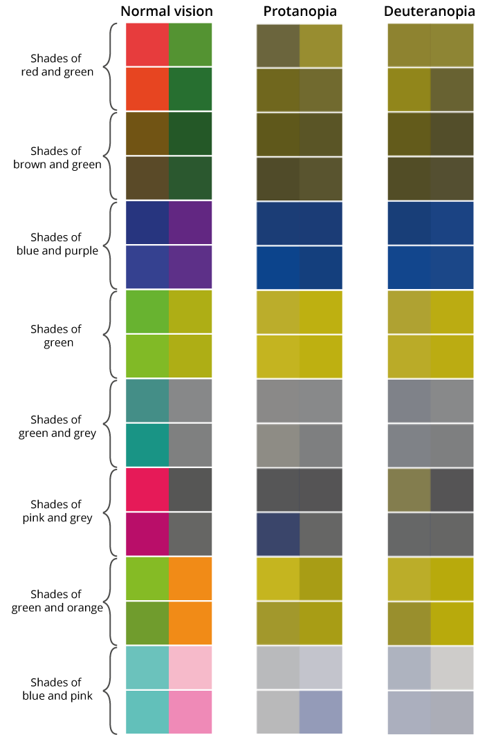
Photo from ONS.UK
Redesign color palette
We apply the color we generated which meets optimal standards.
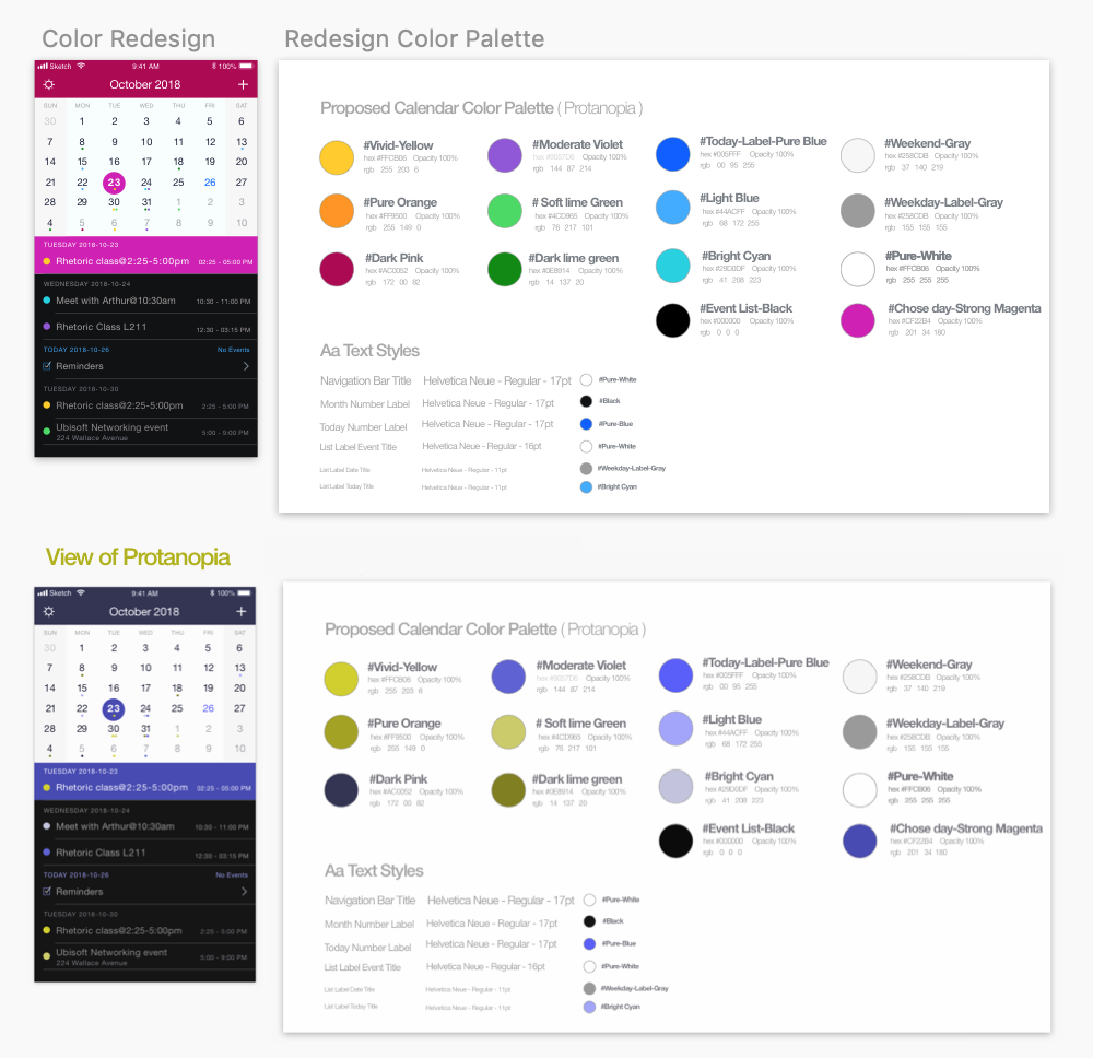
Redesign color palette
Not just change color
Despite we apply the redesign color, we also imporve the structure of UI.
Firstly, we fixed the problem of non-explicit present what day is today. We apply a light blue for today's date number. As same as the colour of "TODAY" which on the below list.
Secondly, we improved the picked day to have the highlight on both the calendar and the list. As you can see our redesign, the users won't need to think which content on the list is matched with the day they picked.
Finally, we decided to reduce the contrast of the other days haven't be chosen. Makes user can quickly focus on the content of the day they picked.
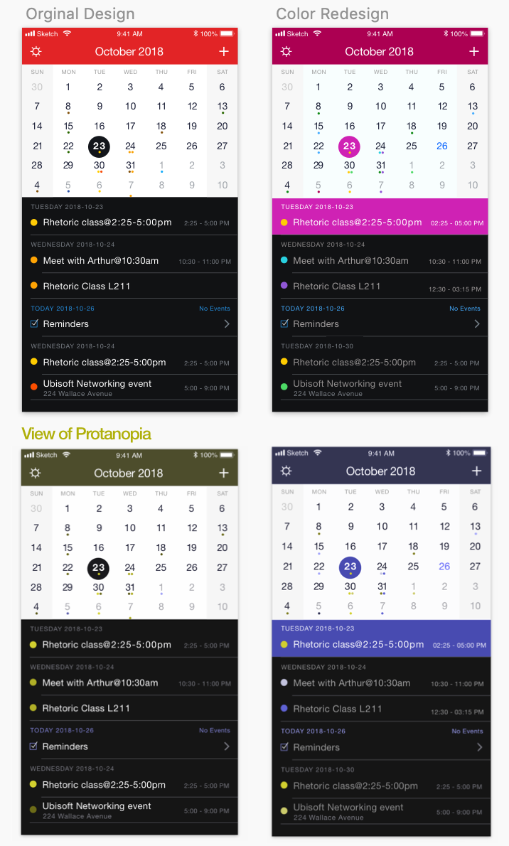
Original vs Redesign
Weekly List
The weekly list is designed to inherit the colour from the monthly calendar. Since we apply our redesign colour, the higher contrast ratio makes the version more clear.
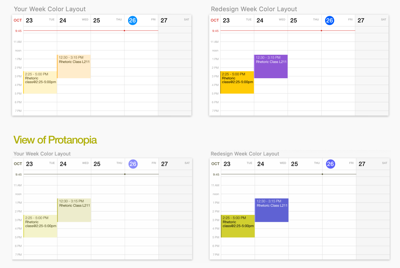
Weekly list- Phone landscape mode
Reflections

Photo by José Alejandro Cuffia on unsplash