GOAL
Can we make the blog index page a long-lasting style with a better reading experience?
Team
Chih-Ling Kuo (Me, UX/UI designer)
Willy Liu (Front-end Engineer)
DATE
Sep 2019
TIMELINE
2 Weeks for design
1 Week for development
My Contribution
UX analysis
UI design
Design system
Design spec
TOOL
Empathy map
UX competitive analysis
Moodboard
Lo-Hi fidelity prototype
Moderated usability testing
Preference testing
CONTEXT
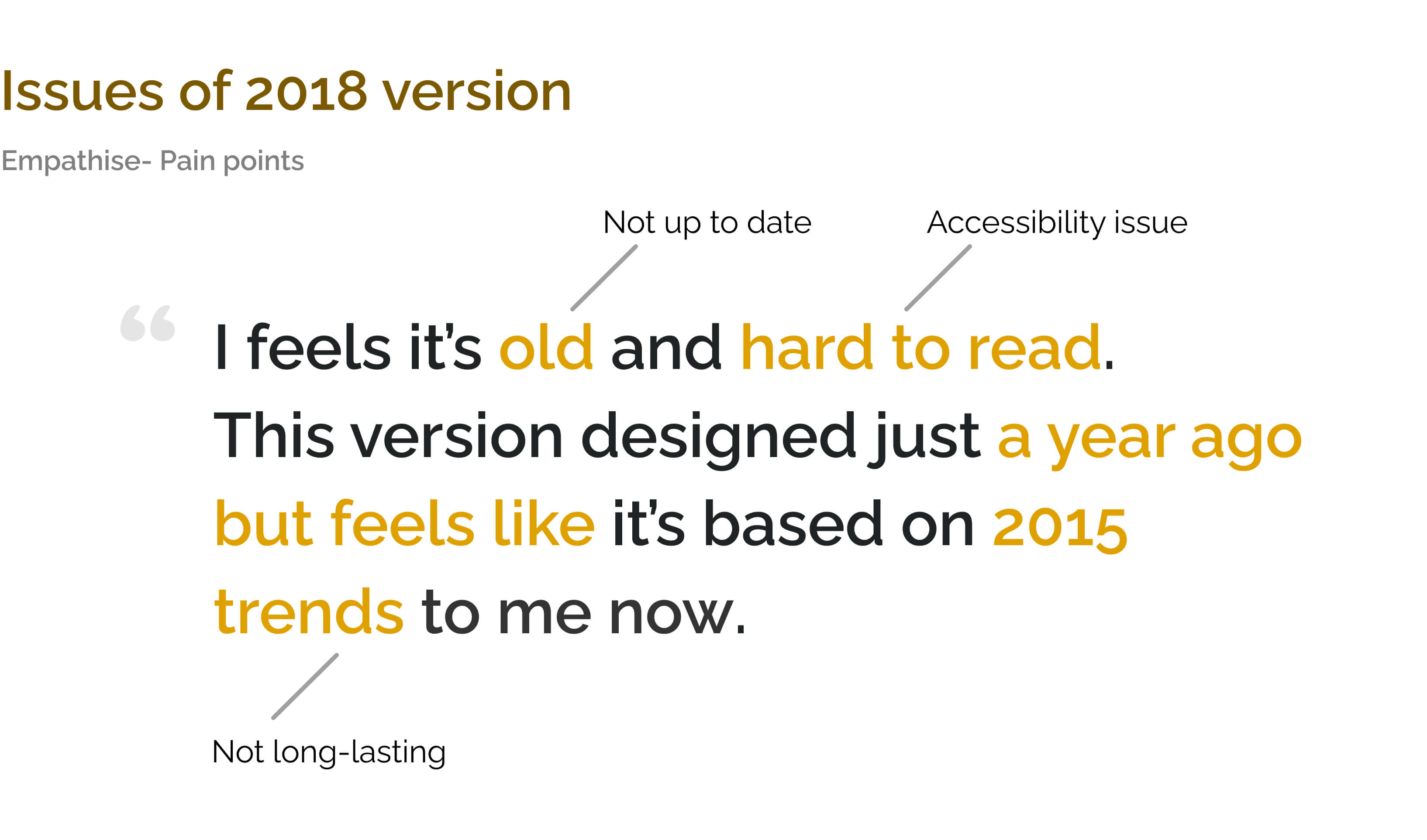
Glasnostic blog page was designed in 2018 by a previous designer. However, it doesn't good enough when you review it in 2019, which makes the CEO unsatisfied.
What is the problem?
The current blog design feel out dated, the layout is weird and not easy to read.— Tobias, CEO at Glasnostic
Design process

1.Defining the Problem
Empathy map
Empathy map
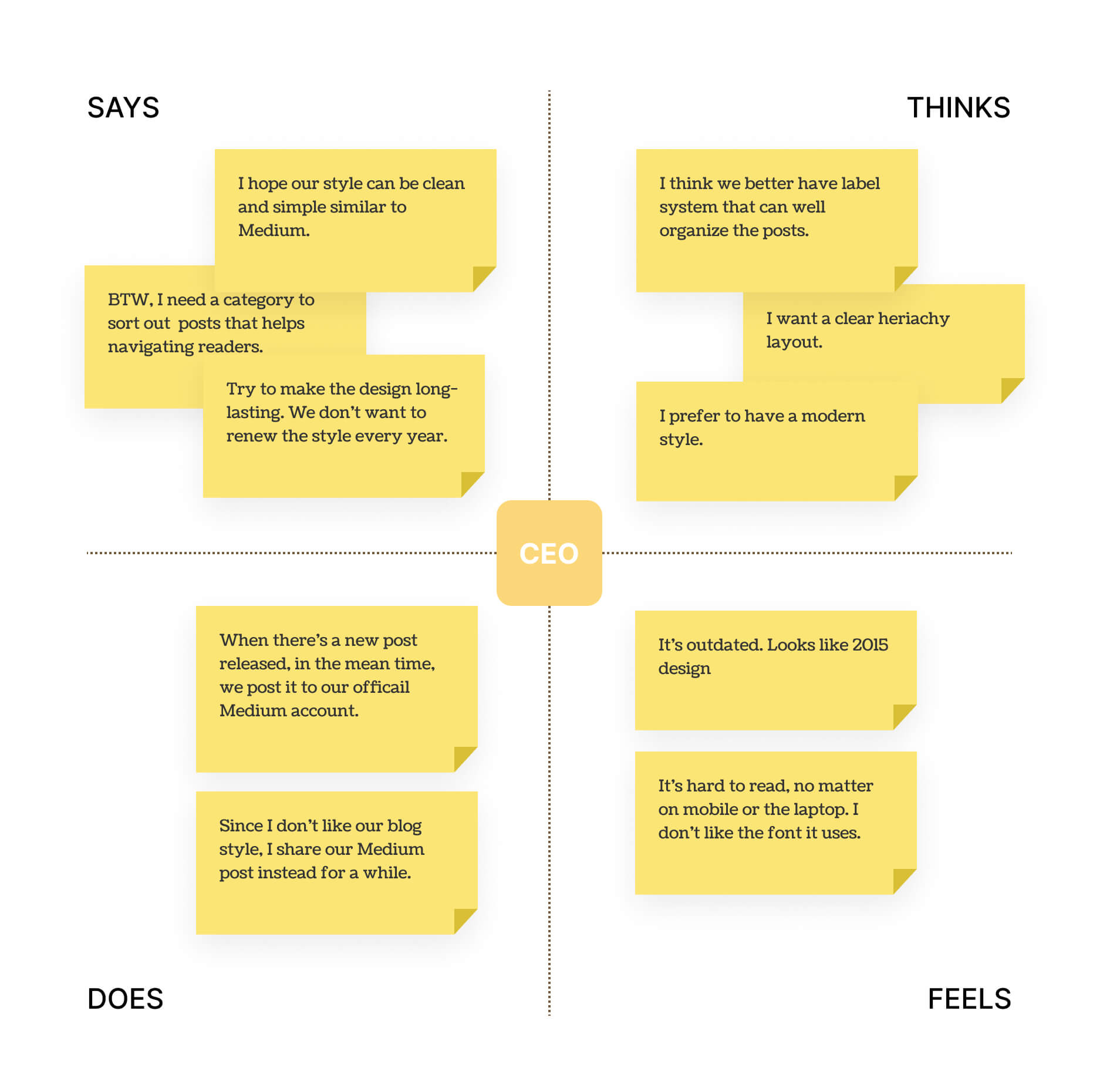
I started by holding a brief interview with the CEO and listening to his feelings about the blog page.
Taking notes that included:
Pain points.
Expectations.
What did he hear from others about the current blog index page?
How he shares a new blog post with others?
Break down
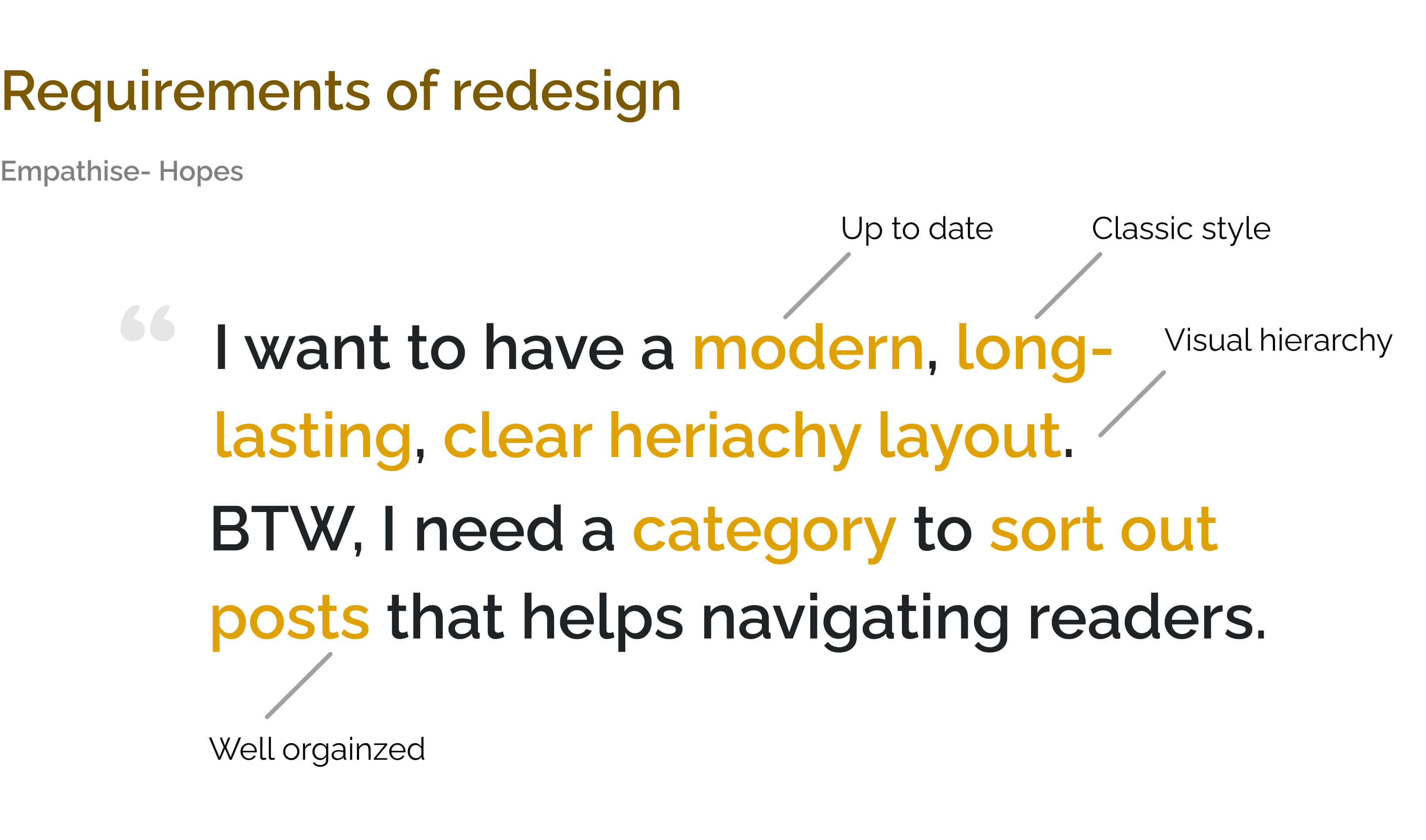
Let's break down the feedback from Tobias. I reorganized them into two sentences below.
Generate possible solution keywords, i.e. Accessibility, Visual hierarchy, and Classic style.
Discover more issues
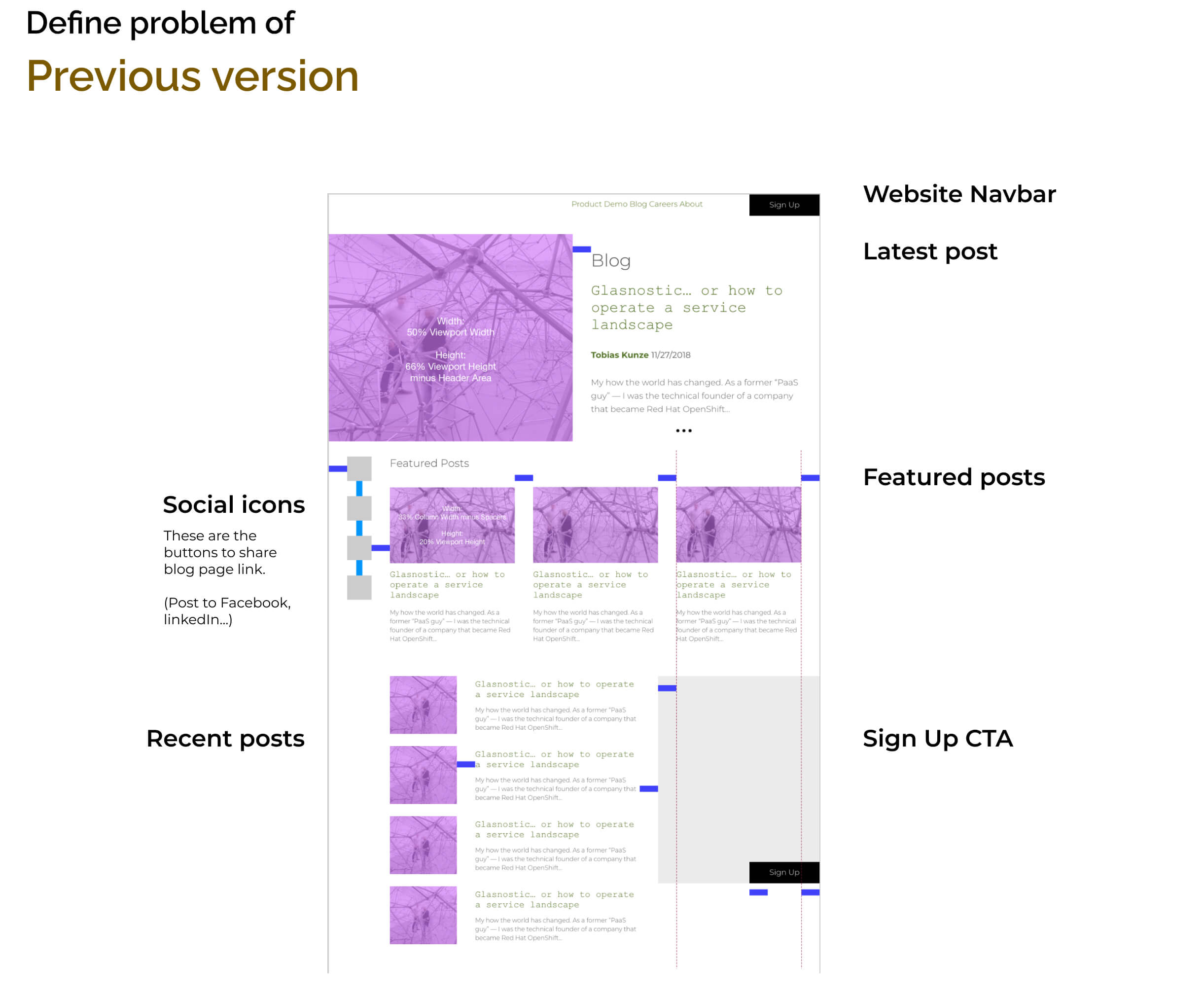
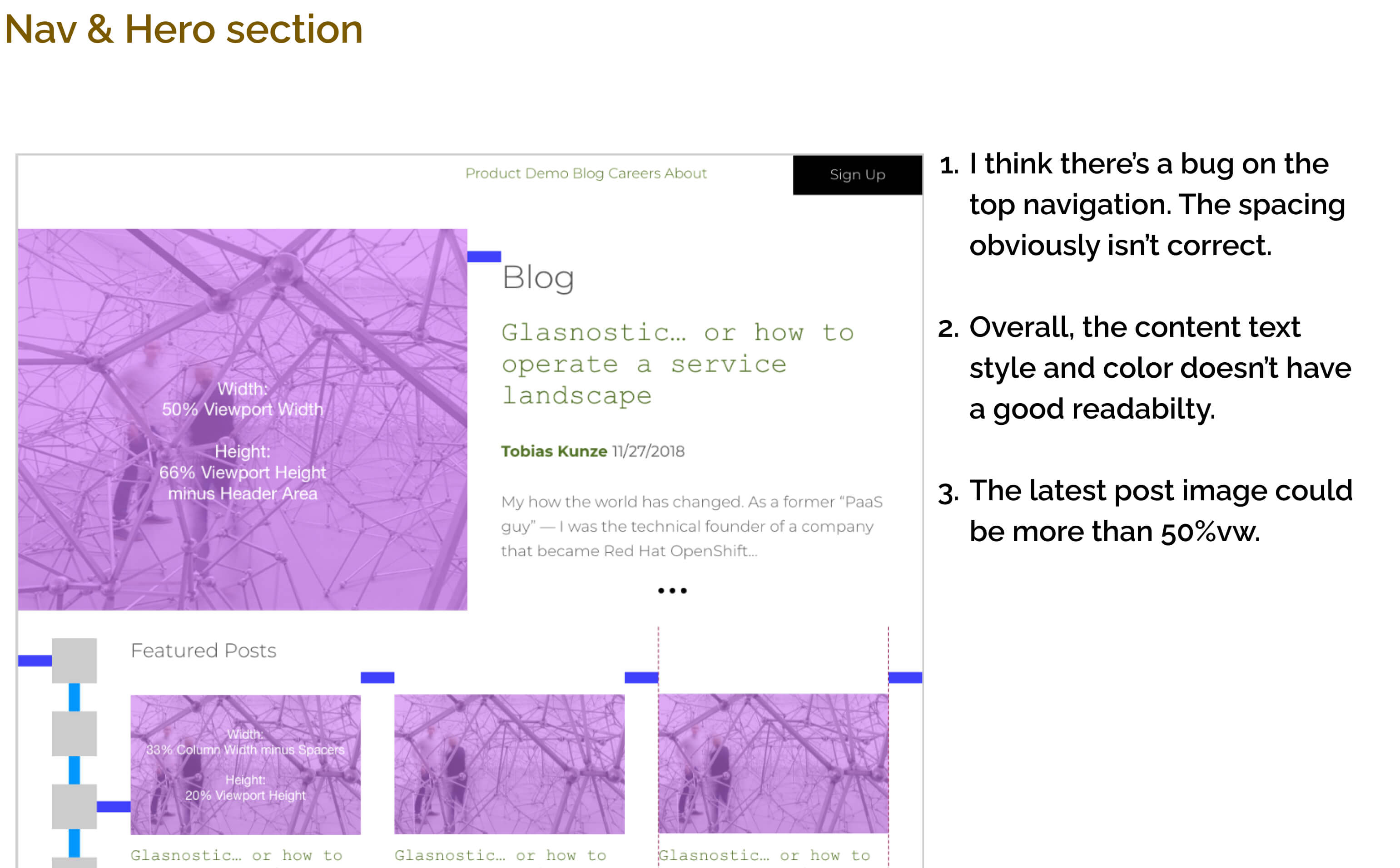
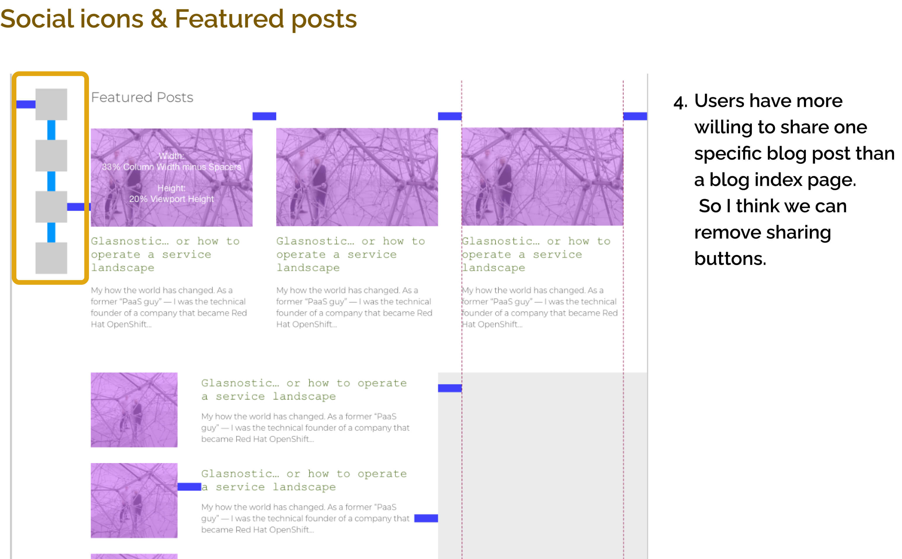
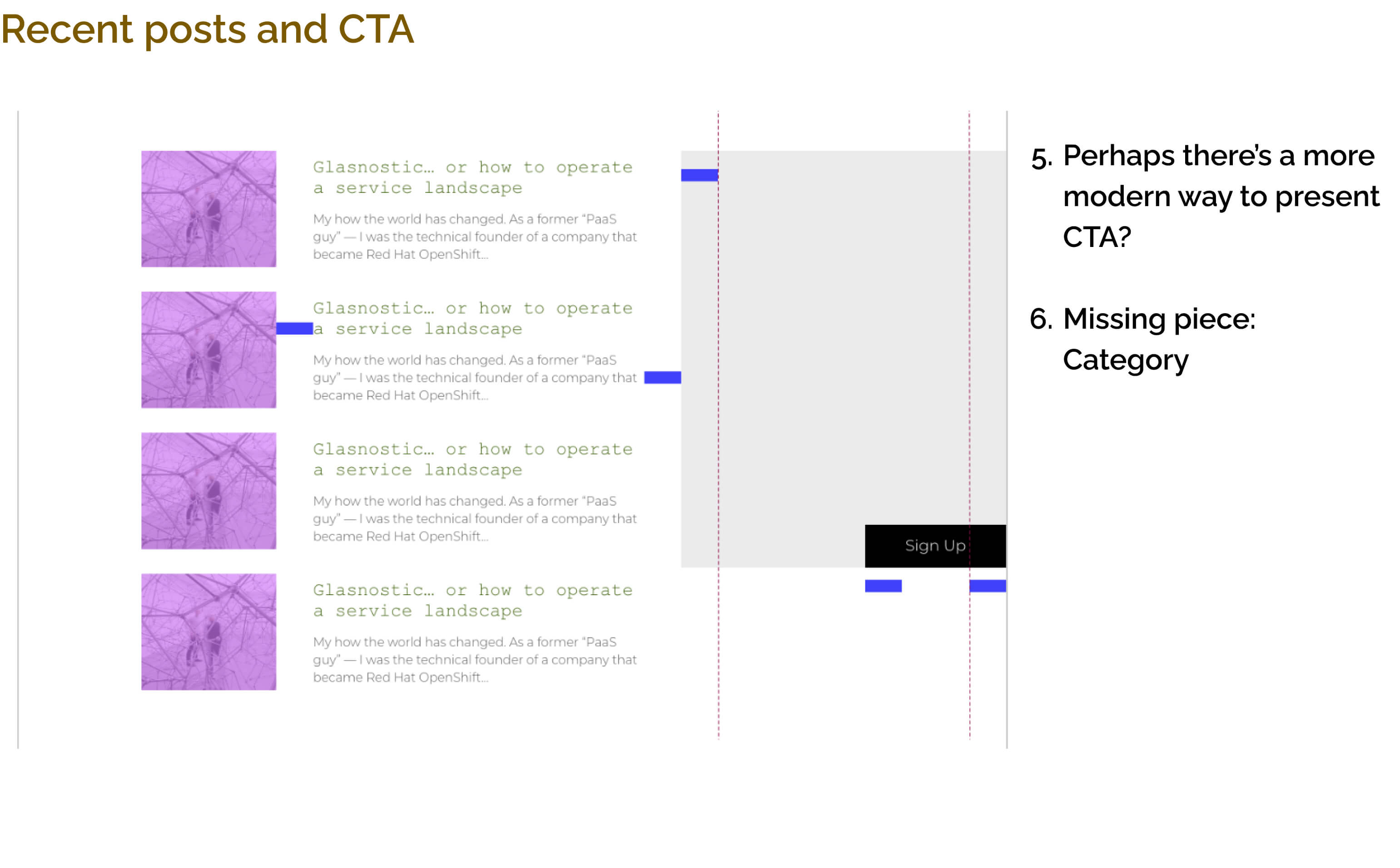
Although, I gathered the feedbacks from Tobias and colleagues. I don't stop there, reviewing the old version to figure out more improvements we need, it's essential to do.
When I start to make this case into my portfolio, the old version blog site is already replaced by my new design. Therefore, I only can show you the old version design spec.
2.Ideation
Match soultions for keywords
Remember that I generate some keywords after a brief interview with Tobias?
I continue with these keywords, and wirte down the matched soultions. For instance, to make a clear visual hierarchy, we can take Gestalt laws of grouping as reference.
For the abstract keywords, such as "Modern" and "long-lasting", I choose to create a mood board and competitive anlysis as inspirations.
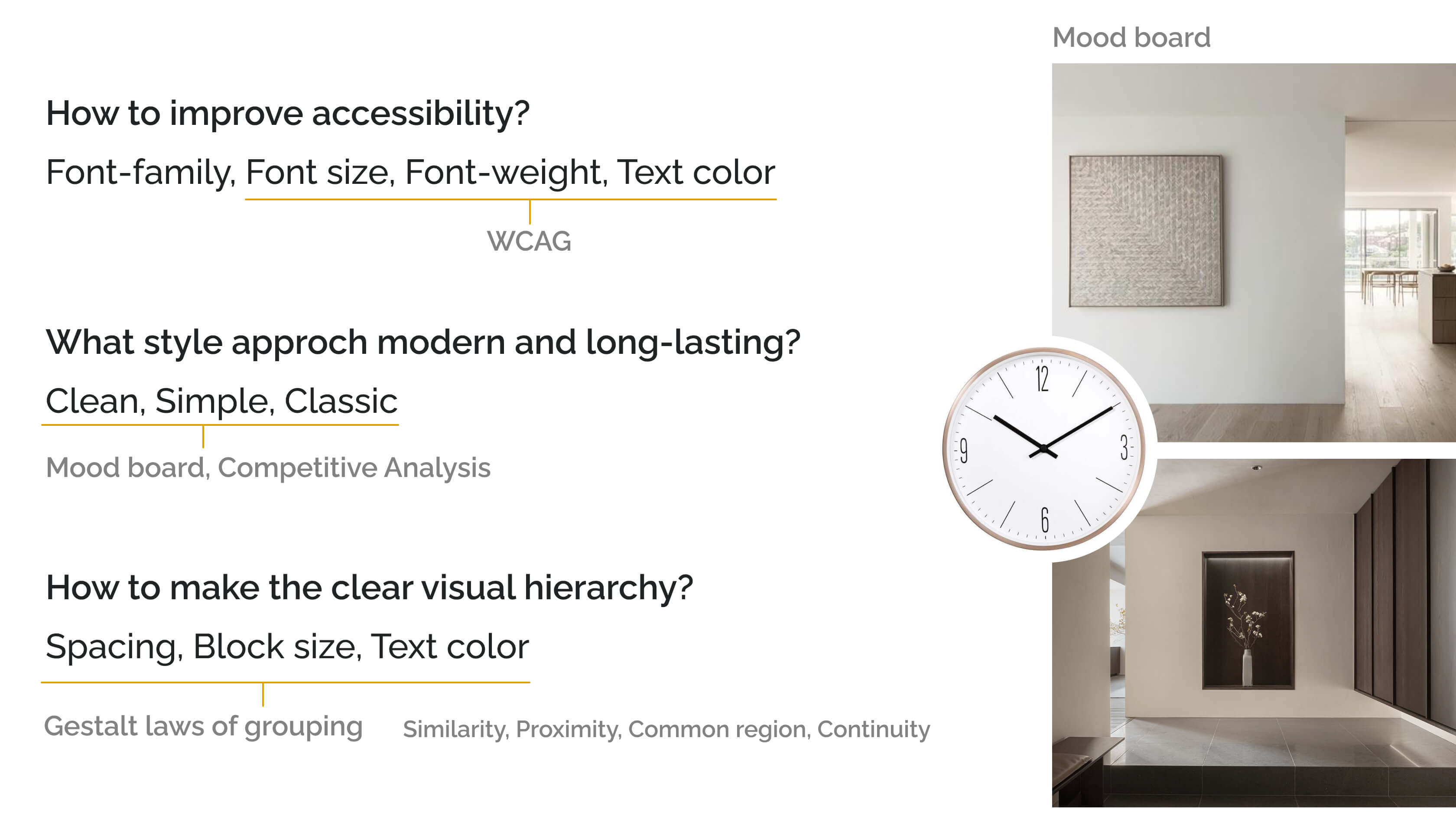
Keywords, answers, and moodboard
Competitive Analysis
To have a comparison with the direct and indirect competitors.
I choose Dynatrace Blog and Datadog as direct competitors which provide similar products and focus on the similar groups.
On the other hand, I choose Google the Keywords blog, Medium, and Airbnb design blog as indirect competitors.
Key findings:
- All of them has categories which matches Tobias's expectation.
- Most of them having enough text color contrast , and a proper font size which makes us easy to read.
- The Airbnb design blog, Medium, and Google blog aesthetics are simple, clean and seems long-lasting to me.
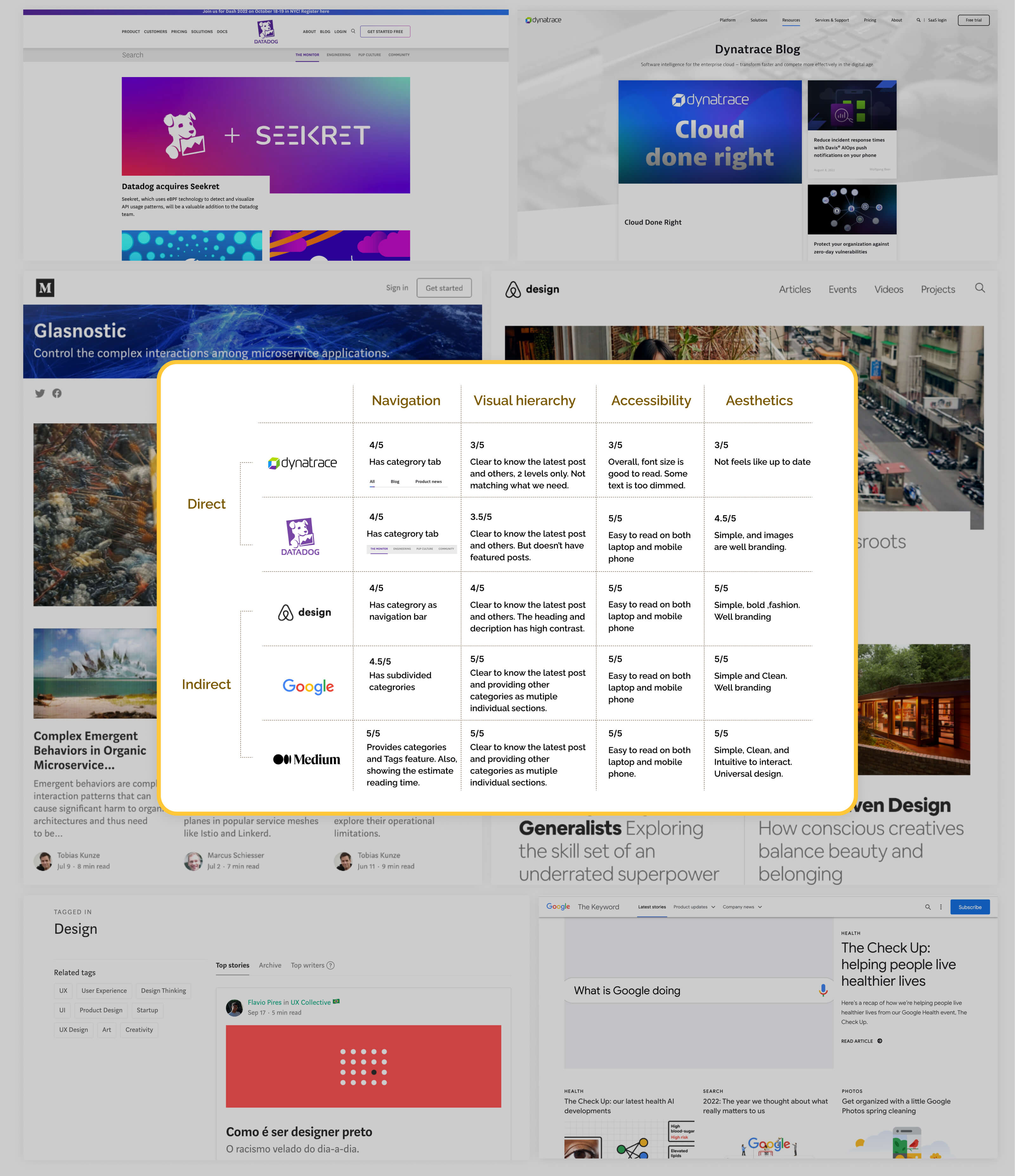
UX competitive analysis
3.Prototype & Test
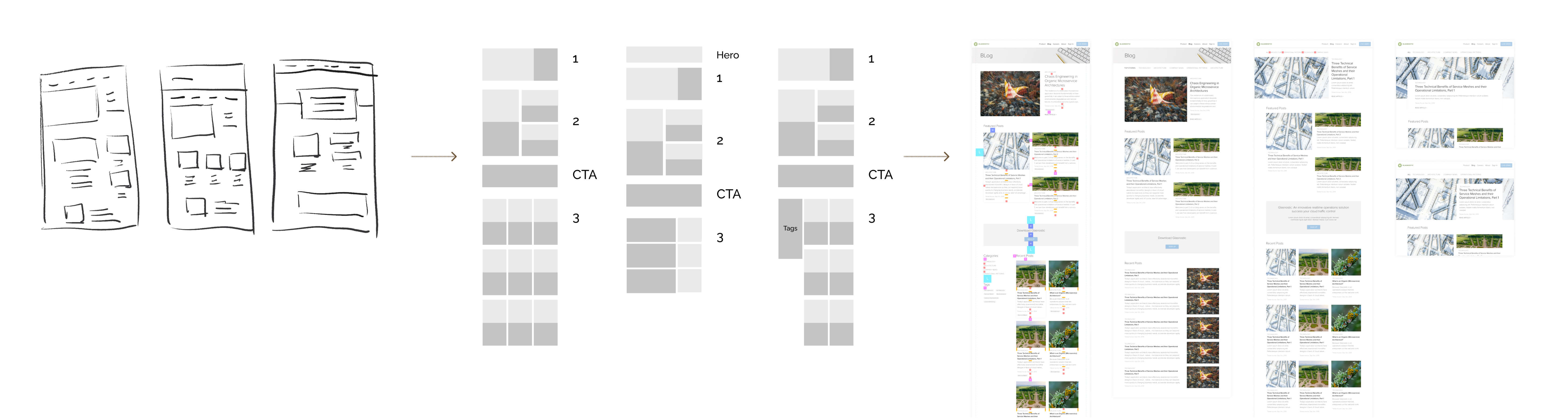
Lo-Hi prototype
Prototype process
In the Lo-Hi prototype process, I made one mistake. I didn't check the feasibilty about Tags system with our front-end engineer before heading to high-fidelity prototype.
When he saw the "Tags" on my prototype, he says, we can't affort to have it. It's time consuming to build the Tags feature, our timeline is limited.
Thankfully, the "Tags" are not necessary to have, it's good enough to have categories as subnav.
Tags
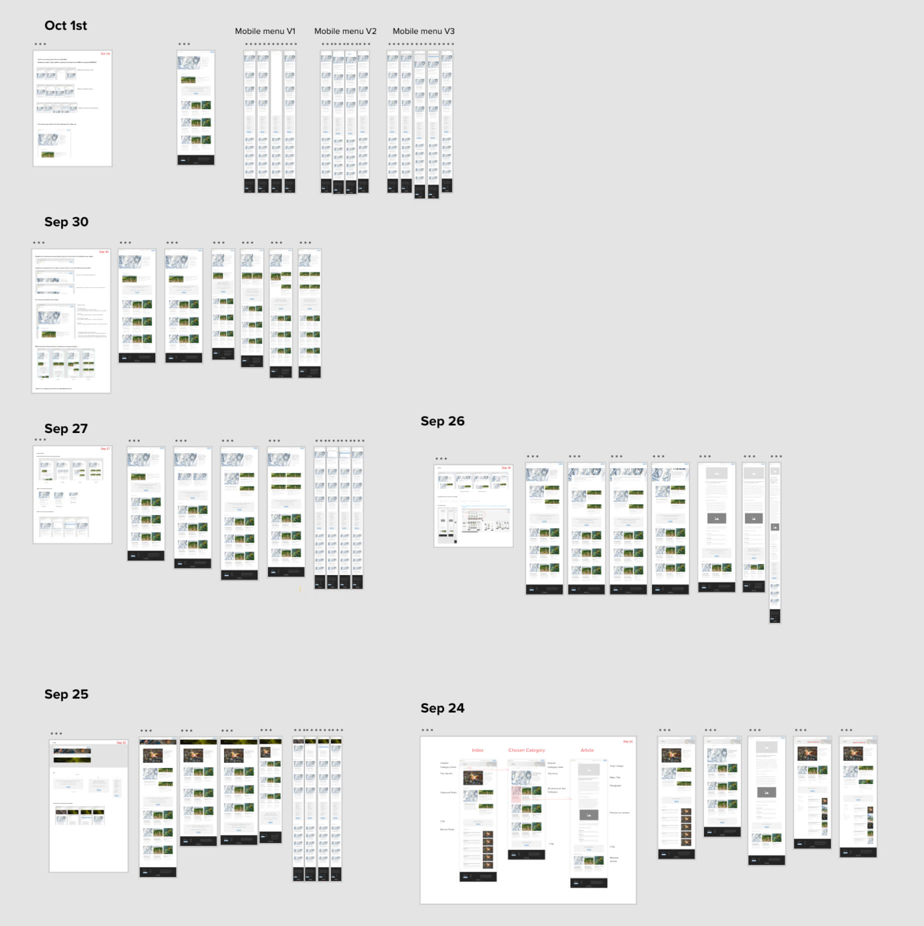
Test, Reiterate, and Repeat
Test, Reiterate, and Repeat
After I build out my prototypes, I did several test with my colleagues and CEO.
Firstly, I break down the tests as reviewing categories, hero section, feature posts and the rest.
Then, assemble the elements which got most scores to make the final prototypes.
Does that the end? Nope, I have to ensure the combination still good to everyone. Some elements got same votes, better to have one more round comparison on the assembled version.
I ask my colleagues to review the full prototype not section by section in the end.
4.Final version
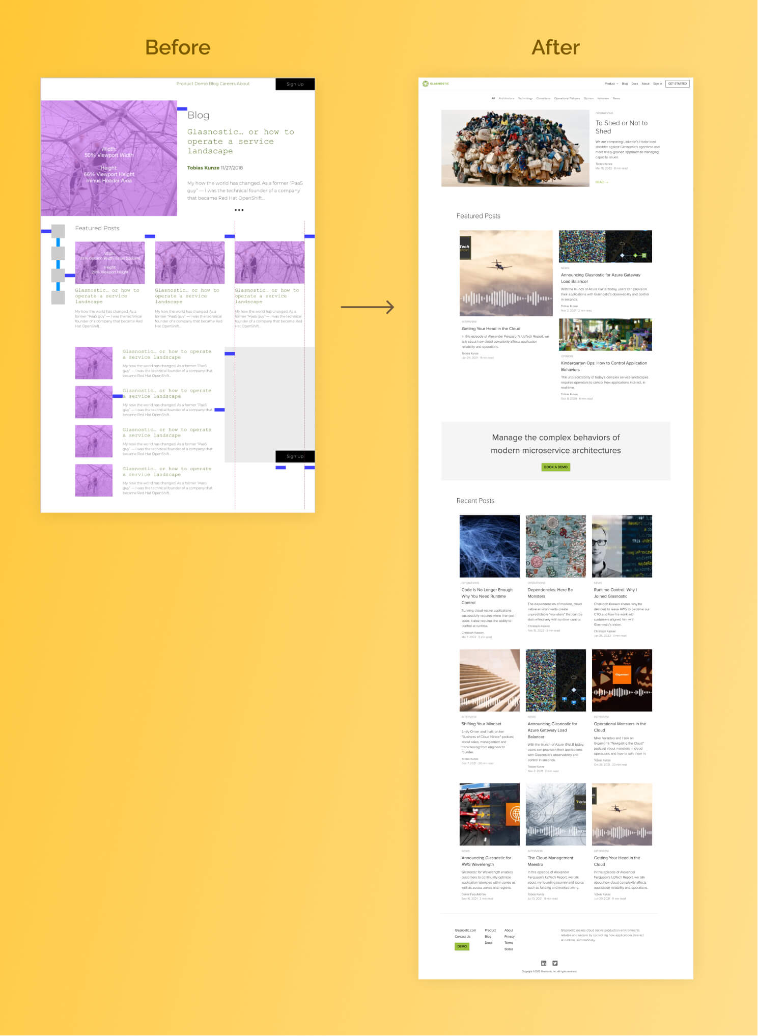
Final outcome
Check it in live
Click here to see the Glasnostic blog index in live.
Does the problem solved?
Yes, it does. Yay!
I'm supper happy with this. It's simple and clean. I love this design so much, I believe it can be long-lasting.— Tobias, CEO at Glasnostic
Design system and spec
After the prototypes are approved from CEO, I heading to prepare the design system and spec deliver to front-end engineer. While preparing the spec, I check company's website code, Scss document, in order to speak the same language with engineer. I'm happy that I prepared detailed and understandable spec for Willy (front-end engineer), also learned a little more coding.
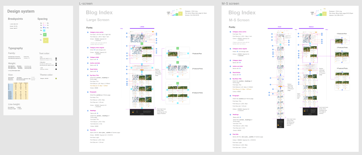
Design system and spec
Text colors matters
See the texts are basically the same color but using opacity to structure out the hierarchy.
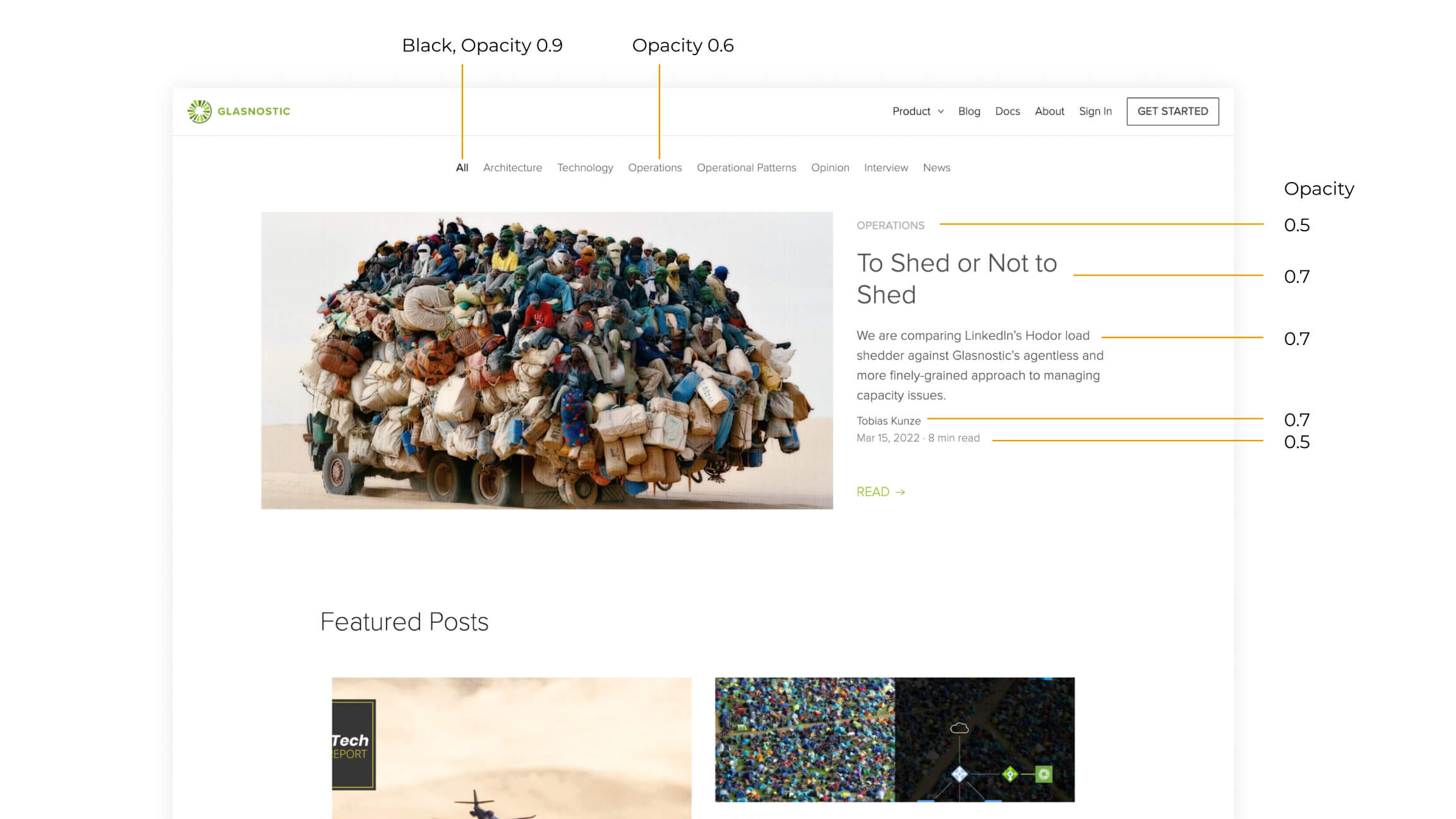
Text color matters
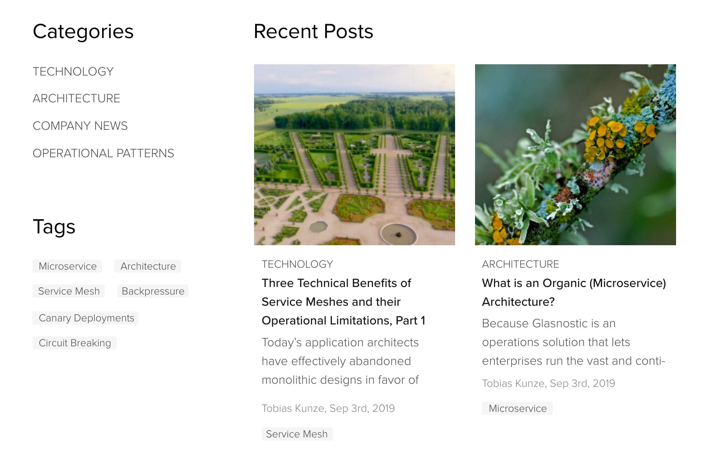
Featured posts section is flexible
What if our feature post are not always 3 posts?
No worries, I cover it. I provide the layout that can fit 1 to 4 posts.
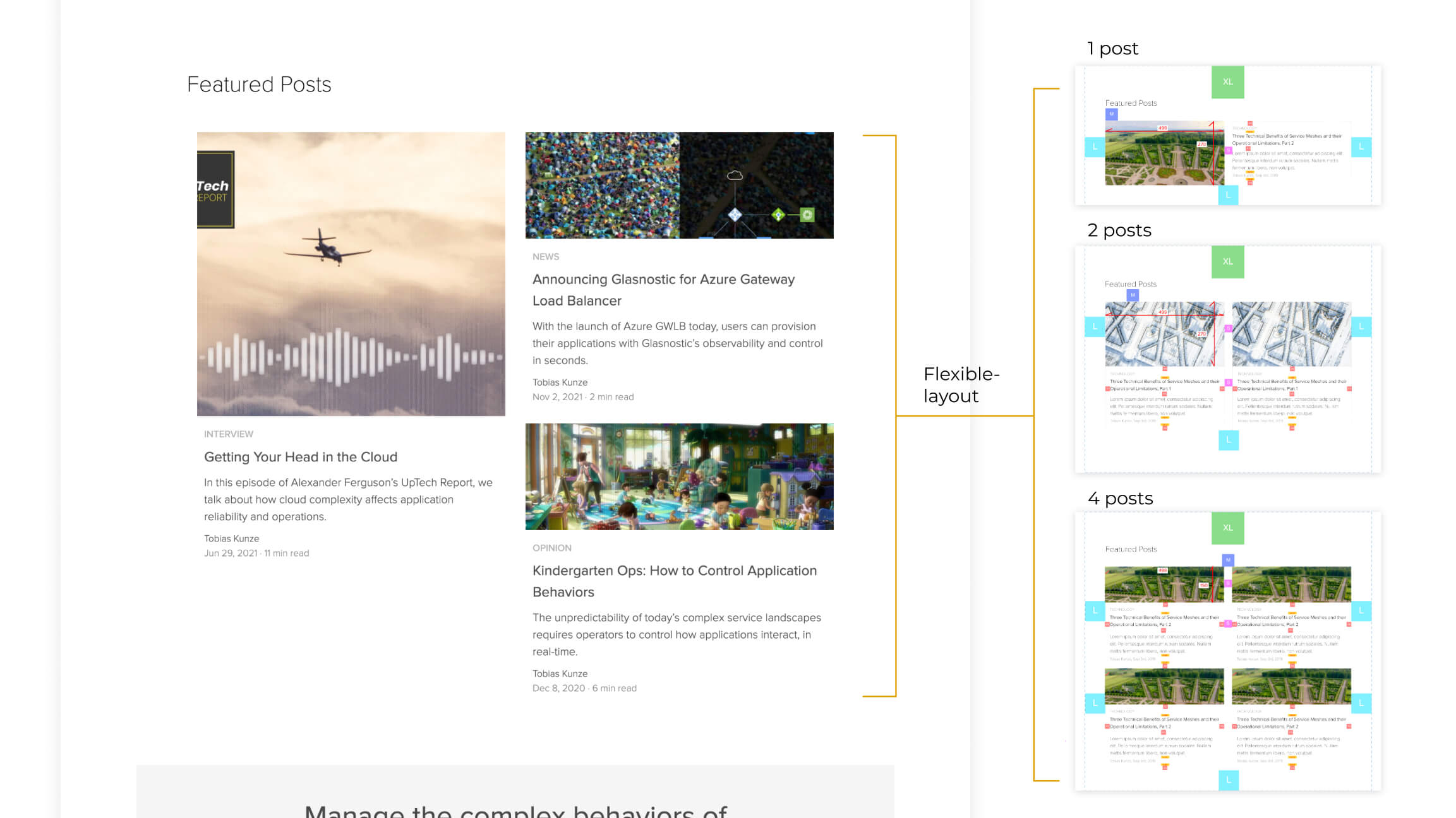
Flexible layout
Keeps visual hierarchy clear, even on mobile phone
We need a way to keep the difference between featured posts and recent posts.
I intend to make recent posts having shorter images compare to featured posts.
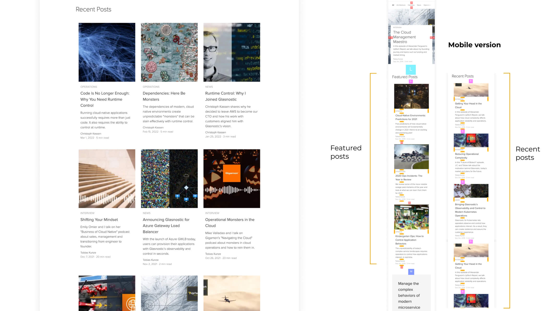
Recent posts
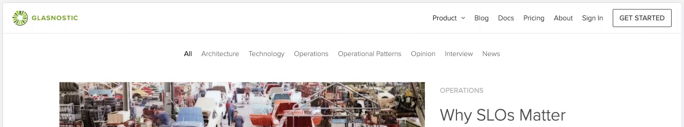
A further change about top navbar
After we released the blog index page. CEO says he wants to add a light weight CTA string on the top navbar. Scrolling down see navbar changes.
I also add a further changes, the blurry transparent background like a glass. It makes the CTA softer and modern.
Reflections
- What worked WELL?
I appreciate that CEO, Tobias, shared many feedbacks at the very beginning. Let me find good insights of what he likes and hopes.
The requirements are clear and straight.
Big thanks for my teammate, a supportive front-end engineer, Willy Liu, he is like my coding teacher. Teach me what are feasible to do and what are not.
Helping me pervent the mistake.
- What DIDN’T go well?
I should ask more quetions to front-end engineer before making prototype. I should consider the feasibilty of implmentation ealier.
That can save more time and be efficient.
- What I might try NEXT?
Since I didn't have enough time to design a better the CTA section on the index page.
It currently is a gray background. I intended to keep it not standing too much. Consider the advertising blindness, a good way is try to make the CTA naturally blend with the page.
I appreciate that CEO, Tobias, shared many feedbacks at the very beginning. Let me find good insights of what he likes and hopes. The requirements are clear and straight.
Big thanks for my teammate, a supportive front-end engineer, Willy Liu, he is like my coding teacher. Teach me what are feasible to do and what are not. Helping me pervent the mistake.
I should ask more quetions to front-end engineer before making prototype. I should consider the feasibilty of implmentation ealier. That can save more time and be efficient.
Since I didn't have enough time to design a better the CTA section on the index page. It currently is a gray background. I intended to keep it not standing too much. Consider the advertising blindness, a good way is try to make the CTA naturally blend with the page.